When is skeuomorphism ok?
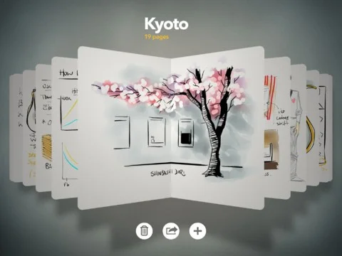
I once worked on a project that tastefully used skeuomorphism to create an emotional connection to the interface. It was a tablet sketchbook project and we took full advantage of the benefits of skeuomorphism (comfort, familiarity, emotional connection, aesthetic).
The project would later morph into an iPad app called Paper. The team that built Paper did a fantastic job and you can see how skeuomorphism is alive and well in this app. Paper won app of the year in 2012.
Previously I talked about how skeuomorphism has become out of fashion. Even still there are places to use it and major benefits to using it. Let's talk about appropriate times to use skeuomorphism and tasteful ways of using it.
When to use it:
1. When it reduces cognitive load
When the skeuomorph's metaphor aids the users mental model and reduces cognitive load; USE IT. It should work as a hint towards the interactive functionality.
Imagine a CUT button this is a pair of scissors or a reading app that uses a page metaphor to hint at the interaction model.
2. In productivity tools
In general apps that effectively use skeuomorphism are tools or creation apps because the skeuomorph represents a physical action. Content consumption apps are less effective because the skeuomorph is not directly tied to the functionality. Like a sketchbook or a video editor.
3. When the physicality of the object is inherent to the functionality
It should be tactile and touch based. You should be able to touch the skeuomorph and not be forced to interact with it through a proxy (mouse). The hints the skeuomorph gives you for interaction need to be able to be carried out with touch.
How to use it:
If you're going to use skeuomorphism you need to commit to an aesthetic. Keep it clean and keep it bold but follow the metaphor through as much as you can.
Make it responsive to touch. No one wants to see a representation of something physical and not able to manipulate it.

